
How Commercial Paint Color Choices Influence Customer Behavior in Cedar Rapids, IA Retail Spaces
Color is one of the fastest ways to shape how customers feel and behave, and it is a powerful lever for commercial painting in Cedar Rapids, IA. The right palette can slow shoppers down, raise average order value, and strengthen brand recall. Done poorly, it can create glare, confusion, and quick exits. This guide explains how smart color choices work inside local retail spaces and how Mike Wolfe Painting, Inc helps you use them to your advantage.
What Color Psychology Means For Retail
Our brains make snap judgments within seconds, and wall color sets that tone before a single product tag is read. Warm hues like soft terracotta or muted coral can feel friendly and energetic. Cooler families such as sky blue or mist gray calm the space and draw focus to merchandise. Saturation and contrast matter as much as hue, especially under the mixed lighting common in Cedar Rapids stores.
- Warm, mid-tone colors can boost browsing time in boutiques and gift shops.
- Cool, desaturated palettes help tech, eyewear, and wellness brands feel clean and precise.
- High-contrast accent walls steer traffic toward new arrivals or checkout.
- Low-contrast neutrals reduce visual noise and let premium products stand out.
Think of color like a playlist. One strong chorus, a few accents, and a consistent rhythm. If every wall shouts, customers tune out.
Aligning Paint Colors With Your Brand In Cedar Rapids
Retailers around Downtown Cedar Rapids, the NewBo District, and Czech Village serve distinct audiences. A children's boutique might choose playful pastels with soft white trim. An outdoor retailer near Collins Road could lean into earthy greens and charcoal accents. Your brand voice should drive the palette, but it must still feel right for Eastern Iowa tastes, light, and seasons.
Start with your primary brand color on a feature wall or fixture band. Pair it with two supporting neutrals for balance. Use a restrained accent near the entrance or hero display to create a memorable photo moment that fits your brand and the neighborhood vibe.
Lighting, Finishes, And Why They Change Everything
Natural light in Cedar Rapids can swing from bright summer afternoons to gray winter mornings. Fluorescent or LED color temperature also shifts how paint reads. A blue that feels crisp at noon may look steel-cold at 5 p.m. under cool LEDs. That is why large samples and in-store mockups are essential.
- Cool LEDs make blues look icier and pinks less saturated.
- Warm spots deepen reds and can muddy delicate neutrals.
- Matte hides surface flaws but can scuff in high-traffic aisles.
- Eggshell and satin offer cleanability without glare on product packaging.
Test colors under your store's actual lighting, including evening hours, before you commit. A 2-by-3-foot swatch on foam board is more honest than a tiny chip.
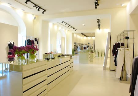
Designing Customer Flow With Color Zoning
Color helps organize space as clearly as fixtures do. Use a calmer base color for the main floor, then create subtle "zones" with slightly warmer or cooler walls in departments. A deeper tone behind checkout anchors the destination and increases perceived order. Accent stripes or painted pilasters can act like signposts leading from the entry to feature tables and then to fitting rooms.
In long corridors or narrow shops common near Czech Village, a gradient that darkens toward the back can pull shoppers inward. For wide, open layouts like those near Lindale Mall, repeating a brand band at consistent intervals keeps sightlines tidy and encourages full-store circulation.
Color Choices That Influence Buying Decisions
Different categories benefit from different cues. Food, beauty, apparel, and electronics each respond to unique emotional triggers. Here are patterns we see work for Cedar Rapids retailers:
Contrast drives navigation and basket size. A lighter field color plus a medium accent behind best sellers makes those areas "pop" without feeling aggressive. Earthy, mid-value hues near fitting rooms help customers relax and spend more time trying items. Clean, cool neutrals behind high-tech products reduce visual noise and suggest precision and quality.
Limit the number of competing accents. One strong focal wall and one secondary accent are usually enough. Too many brights can feel like a clearance event, undermining premium pricing and brand trust.
Seasonal Strategy For Eastern Iowa Stores
Cedar Rapids winters are long and cloudy, so interiors can feel dim by late afternoon. Slightly warmer whites, gentle creams, and honeyed woods keep the space lively without overheating the palette. In bright, humid summers, cooler neutrals with fresh green or aqua accents feel crisp and clean. Rotating small accent areas with seasonally tuned color is smarter than repainting the entire store.
For example, a NewBo boutique could switch a display niche from blush in spring to soft sage in summer. A home goods shop near Downtown might move from warm taupe to mist gray on a single feature wall while keeping the rest of the store consistent. The backbone stays stable, and the accent evolves.
Durability, Cleanability, And Health Considerations
Retail walls take a beating from carts, handbags, and fixtures. Choose professional-grade coatings with scrubbable finishes in high-touch zones, and consider scuff-resistant formulas in high-traffic areas near aisles. Entry vestibules in Cedar Rapids see salt residue in winter that can mark lower walls. A slightly glossier finish at the base level makes cleanup easier.
Low-VOC, low-odor coatings keep staff and customers comfortable. They also help you get back to business faster. For projects that must happen while open, ask about overnight phases and the sealing off of sections to maintain fresh air and customer flow.
Cedar Rapids lighting changes fast in winter. Paint large test swatches and check them at opening, midday, and one hour before close. A color that looks great at noon can feel flat at dusk, so time your final decision carefully.
Common Color Mistakes To Avoid
Picking color from a phone screen is risky. Screens boost saturation and skew temperature. Always compare to a physical swatch and a painted sample board. Avoid painting every wall in your strongest brand color. It reduces contrast and makes signage harder to read.
Samples on large swatches prevent costly re-dos. Try two or three options side by side and live with them for at least two business days. Invite quick feedback from your best associates and a few repeat customers. They see the space at different times and from fresh perspectives.
Real-World Layouts: How To Apply Palettes
In a narrow storefront near Czech Village, start with a soft neutral like warm white for the long walls. Place a mid-tone brand wall at the back with brighter lighting aimed at new arrivals. Add a gentle color band at shoulder height along the right wall to guide customers deeper. Mirrors opposite that band reflect light and visually extend the palette.
For a larger store around the Collins Road corridor, map zones by department. Home fragrance stays in a cozy neutral with a blush accent. Kitchenware moves to a cooler gray that highlights stainless steel. Seasonal goods get a flexible wall that changes color each quarter. Wayfinding becomes intuitive because each department "feels" different while staying on-brand.
Why Work With A Local Commercial Painting Contractor
Local experience matters. A seasoned painting contractor understands how Midwest humidity, winter salt, and fluctuating store hours affect planning. Sampling under your exact LED mix, coordinating overnight shifts, and protecting fixtures takes a trained crew. Color consultation rooted in retail psychology turns paint from a backdrop into a sales tool.
If you want help translating your brand into a palette that performs, explore our commercial painting services. You will see how we align color, lighting, and finishes to make the store feel polished and ready for peak traffic.
Our Process At Mike Wolfe Painting, Inc
We start with a walk-through to learn your brand, audience, and sales goals. Then we study lighting at several times of day, note fixture heights, and identify high-wear areas. Next, we present two to three coordinated palettes, each with controls for contrast, cleanability, and wayfinding. We paint large in-store samples so you can judge color where it will live.
During prep, we protect floors, gondolas, and POS gear, then prime and apply professional-grade coatings. We schedule phases to minimize downtime and coordinate with your merchandising plan. Low-VOC products and careful ventilation reduce odors, so staff and early shoppers stay comfortable. After final touch-ups, we share care tips that keep walls looking new through heavy seasons.
Want a deeper dive into finishes, sheen, and best practices for retail? Visit our home page to see how our Cedar Rapids, IA team approaches quality from prep to final coat.
Smart Palette Examples That Fit Cedar Rapids Retail
Here are three simple frameworks you can adapt to your space and brand voice:
- Calm Precision: Mist gray field, soft white trim, slate accent behind premium displays. Ideal for eyewear, tech, and wellness. High CRI lighting keeps colors true.
- Warm Welcome: Cream field, pale terracotta feature wall near entry, honey oak fixtures. Fits gift shops and artisan goods across the NewBo District. Makes small spaces feel friendly.
- Nature Refresh: Warm white field, muted green at checkout, charcoal in stock-and-shop transition. Great for outdoor and home categories. Feels clean in summer and cozy in winter.
Ready To Drive More Sales With Color?
Let Mike Wolfe Painting, Inc plan, sample, and paint a palette that supports your brand and moves customers the right way. See what is possible with our commercial painting, then call 319-393-3764 to schedule a convenient walkthrough. We serve Cedar Rapids and nearby communities with careful prep, clean job sites, and finishes that last.
We're the preferred resource in Cedar Rapids for commercial painting and more. Call now for commercial painting in the Cedar Rapids area.
